A date, a name,
and nothing else.
Open with a language, not a logo — and have it ready for the street on day one.
A fixed launch date and six suppliers waiting for a direction.
One identity, decided in the Direction Room, stretched from the façade to the cup.
Alignment before execution. Three routes, decided in one session.

Neighbourhood classic
Warm, hand-set, familiar. Read well on the façade — and disappeared at cup scale.
Not carried—Market-stall bold
Loud, high-contrast, fast. Strong on a poster; too heavy for a menu and a bag.
Not carried—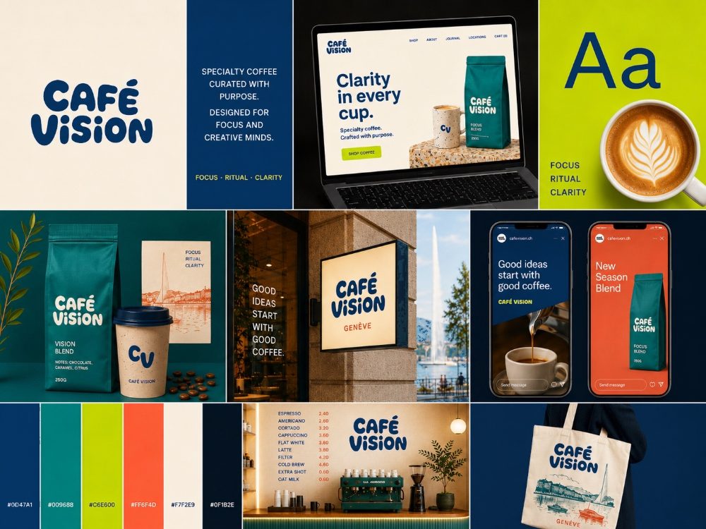
Clarity in every cup
One typographic voice, one green, one grid. Legible at six metres and at eighty millimetres.
Carried to every format✓The same drawing, redrawn for every distance the street has.
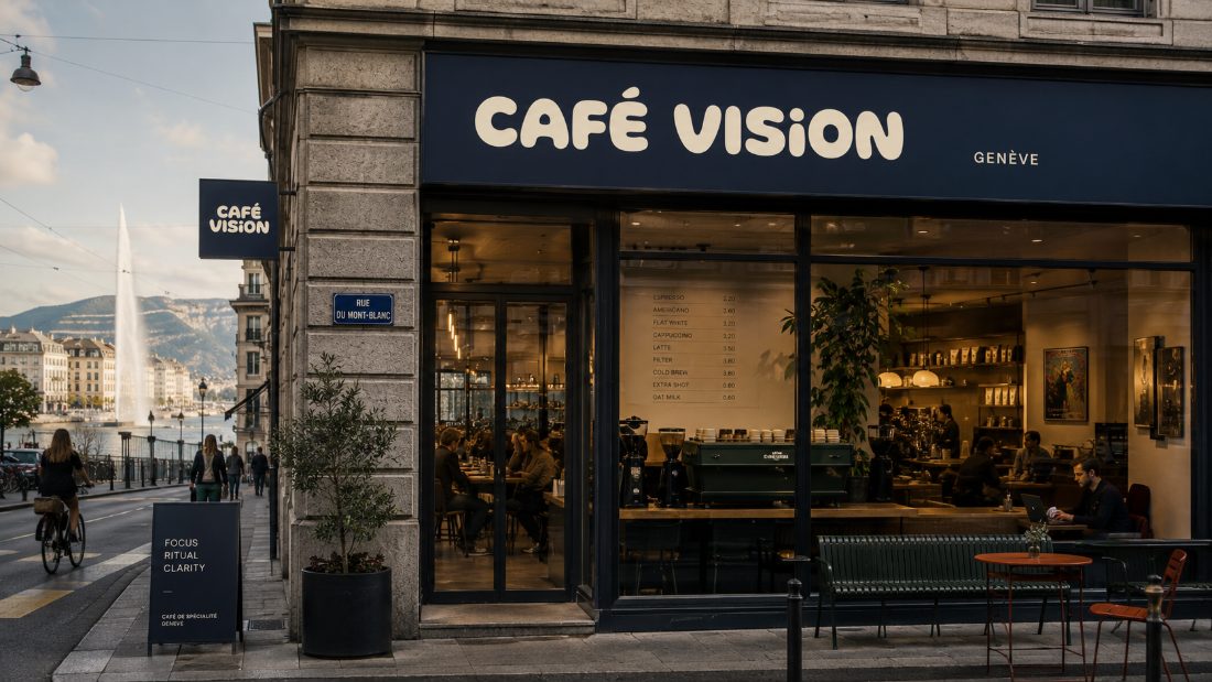
Seen from the tram.
Name only, letter-spaced for distance, one green against the stone.
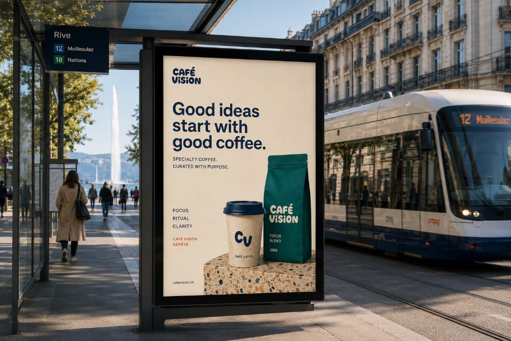
Seen from the pavement.
One line of copy, one product, the key visual doing the rest.
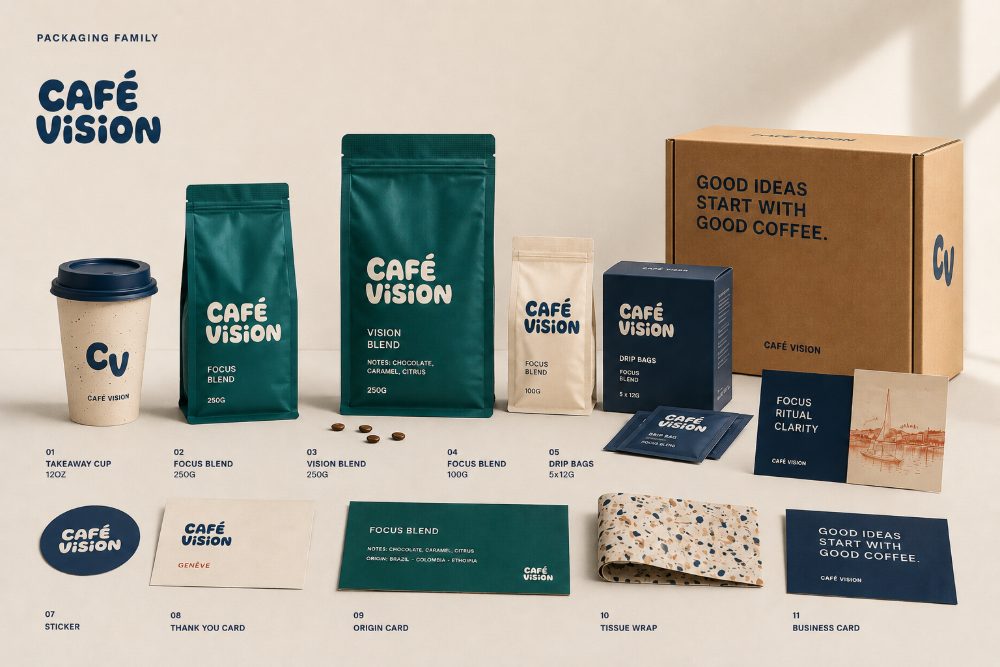
Held at the counter.
The grid becomes a label system: origin, roast, weight — same voice, smaller type.
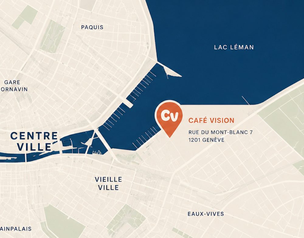
Read on the way.
The map drawn in the brand's own palette — no third-party styling in the kit.
Four surfaces, one afternoon of walking — and the same company speaking each time.
Decide the language once; the street repeats it.
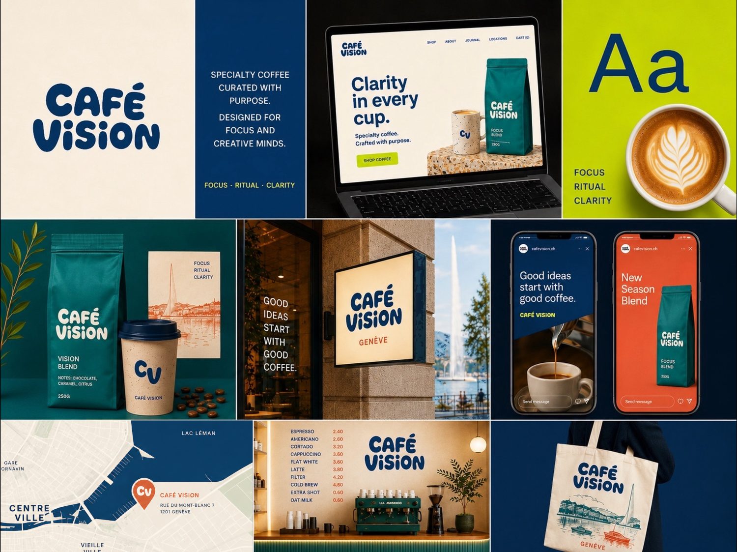
A new flavour or a new poster needs no new studio.
Grid & type
One grid, two weights, fixed spacing steps. Every format inherits the same measure.
Colour & label system
The palette with its roles set — background, ink, one accent — and the label rules that follow.
Editable files
Poster, label, menu and social masters in the team's own tools, ready to fill in.
Formats launched together
Direction, decided before production
Scales, one direction
Decide
One session on the neighbourhood, the menu and the first impression. Three routes; one chosen before anything was produced.
Produce
The key visual was built first; façade, packaging, poster and wayfinding grew out of it inside a single sprint.
Keep
Editable masters for the team — the opening kit keeps working after the opening.